Hayseed, Stream, and Others

Some Hayseed, LLC, behind the scenes. 🤣

I operate my app empire under the name Hayseed and I have two products; RxCalc and Stream.

RxCalc

RxCalc is a Pharmacokinetics Calculator. It’s used to calculate how long drugs interact with the body. Go read about it. It is interesting.

My brother, Jerry, has a PharmD — Doctor of Pharmacy — and loves the more technical side of his profession, he’s a total geek and Chemistry undergrad so of course he loves stuff like that.

We collaborated on it in 2009 because he needed it for work. I did the app and he did the math. We paired to get it coded up and we were approved for the store on July 4, 2009.

It hasn’t changed in years and could use an update to add a new way of doing calculations.

Stream

Stream is an RSS or Feed Reader.

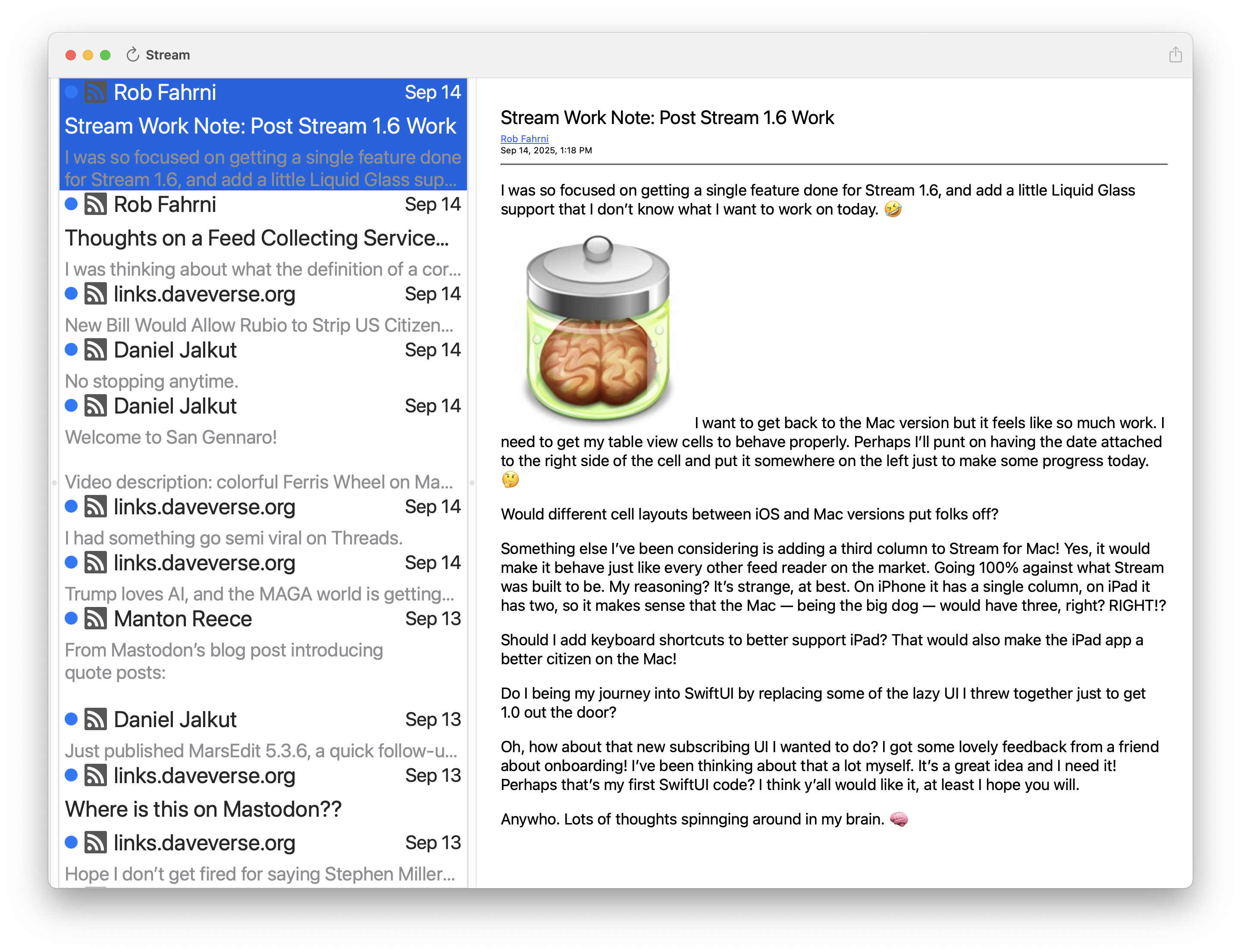
I built Stream because I love blogging and use a feed reader to consume others blogs and news sites. One of these days I’ll ship Stream for Mac! 🤣

I wanted Stream to be slightly different and I loved my Twitter app, Twitterrific from the Iconfactory, so I decided I’d like to have a feed reader that worked in timeline form. So, Stream was born. It presents your feeds in reverse chronological order as you’d see in Twitterrific. Posts from multiple sources are folded together so you can read casually. The initial release didn’t have a read/unread status but it was a highly requested feature so I added it.

Stream is FREE to use but if you like it you’re free to leave a tip. I appreciate every tip I receive. I have a feeling when I do get a tip it’s from a friend, love y’all. ā¤ļø

I am grateful for any support I receive for my apps. Thank you. šŸ™šŸ¼

The feed reader app market is very crowded and you can find excellent readers from multiple companies. Here are a couple I use.

Unread

Unread is a beautifully designed and darned useful app from Golden Hill Software. The iOS App sports a swipe driven user interface, beautiful type, a stellar reader, and my favorite feature, a read later view. It’s labeled as Favorites but you can save random articles to it to read later. I use it multiple times a day. I use the list I build to inform my Saturday Morning Coffee post.

Oh, it also has its own syncing system that is really good! Highly recommended.

Tapestry

Tapestry comes from the amazing folks at Iconfactory. It’s more than a feed reader and is highly customizable.

You can add your everyday RSS feeds but you can also add Mastodon, Bluesky, or Reddit feeds to name a few.

As ever, the UI is beautiful and thoughtful. I use it on occasion just to admire their work. Iconfactory is a shop that embodies what it means to design beautiful, usable, highly performant, and stable software for Mac and iOS.

It is updated at a rapid pace and is evolving to allow you to reply to posts from other services. Like I said, powerful!

Also, highly recommended.

The Push to Stream for Mac 1.0

It’ll be 1.7 in the store so I can sync the iOS and Mac versions. 😃

How close am I? It’s hard to say to be perfectly honest. One day I’ll just declare it good enough and I’ll boot it out the door.

I want to do a bit of work to the leftmost view in the app to make it into a sidebar and shrink up each item displayed there a bit. That’ll mean some font size changes and probably change the size of the icon and tweak the middle column a bit. 🤣

Then again, maybe not? I’m just not sure I want to do it now.

I will definitely do a bit of visual cleanup. I’ve been tweaking it over time and it’s getting closer. I think of the mess I had when I first got it wired together and it’s come a long way.

It’s going to ship without Settings because I just want to get it done. No changing the number of days to keep feed items (it defaults to 30), no alternate icons, and no tip jar. My hope is to rework Settings in the iOS version and do it in SwiftUI so I can bring that work to the Mac. I do want to make it look like it belongs on the Mac, so it’ll get tweaked for sure.

I am going to start doing all work in SwiftUI moving forward since it’s ā€œthe futureā€ of the platform and I need to take the plunge. Over time it’s only going to get better.

AHHHHHH!One of the most disappointing things to me is the number of features and infrastructure changes I’d like to make. Some are mostly hidden — like parsing the web page associated with the feed — or adding some automation support. The list goes on and on. Oh, heck, sync is a huge one at the very top of the list. Then there’s support for other feed backends… ugh! I could go on forever. 🤣
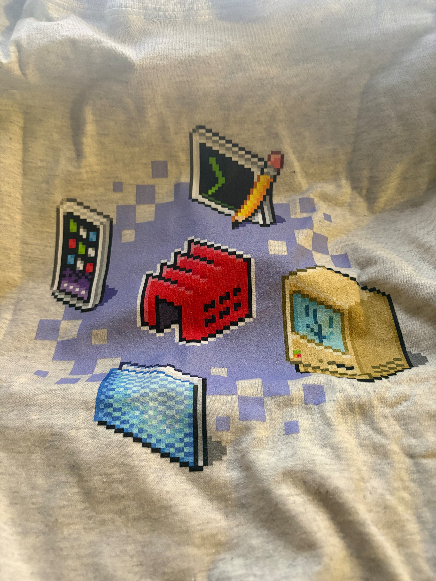
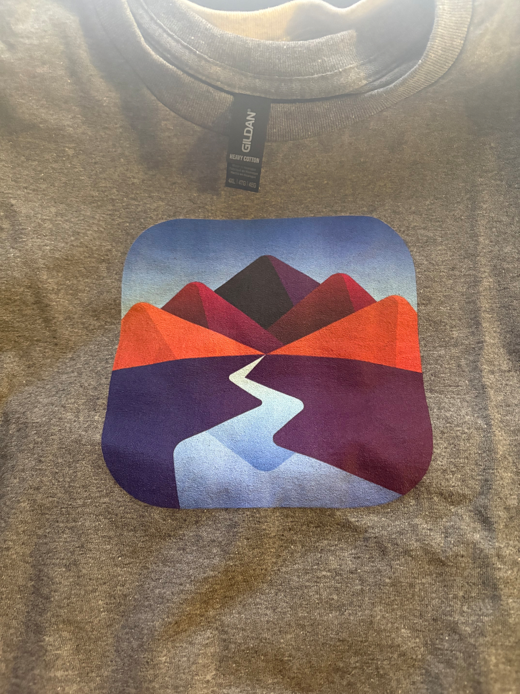
One more thing. I think I’m going to have to pull the Read Later feature from the app if I want to get it out the door anytime soon. That’s going to require considerable work to parse web pages instead of just simple feeds. I have thoughts on it and once I get around to it I think it’ll turn out just fine, but it’s quite a bit of work to do right now.

Just some random thoughts on a Friday morning.

Lookie what I just got!

Work Note: Stream for Mac

What did I get done today? šŸ¤”

I Love RSS!I did a bunch of little things to make the app have fewer rough edges.
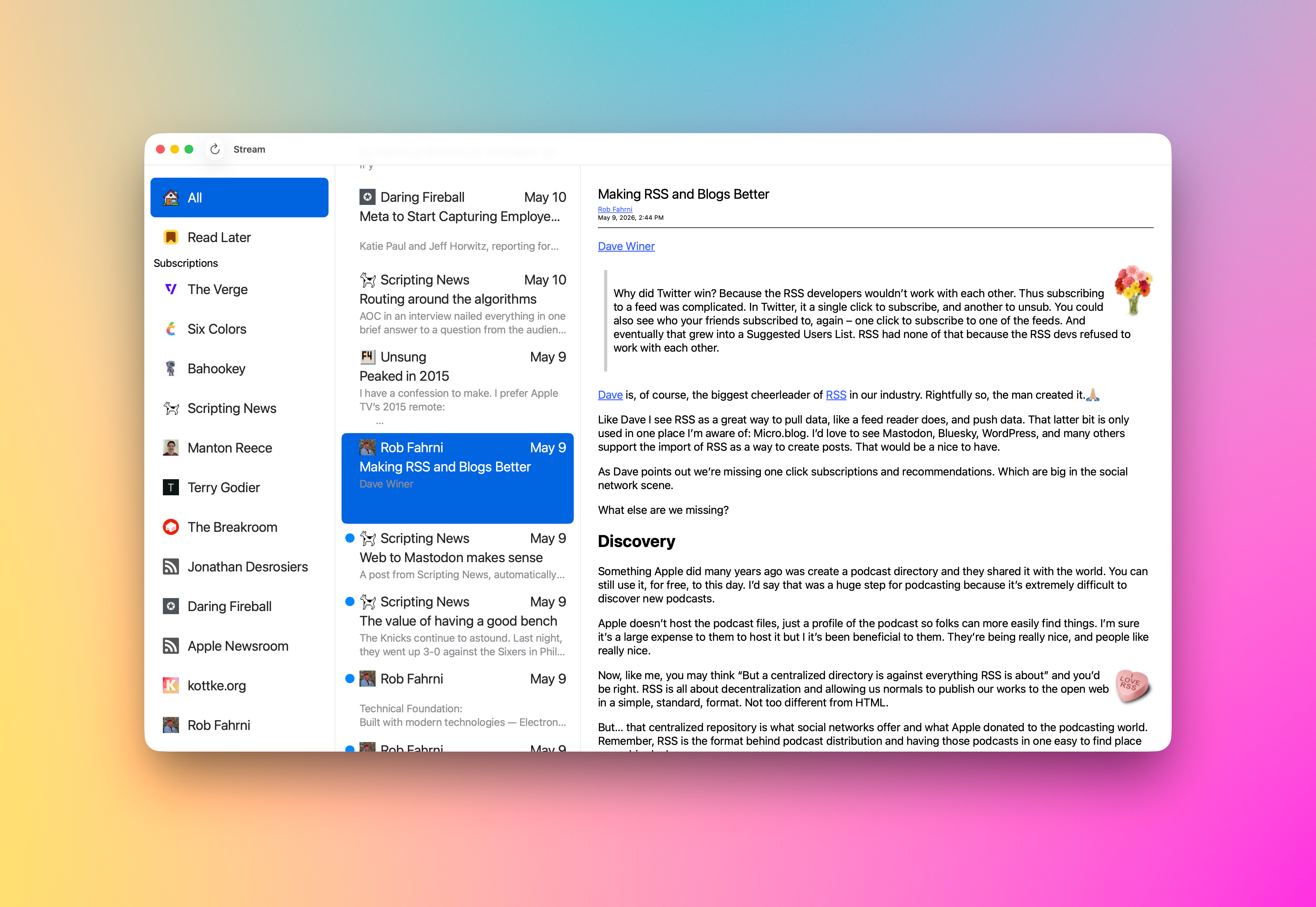

  • Removed the border around the blog list (Thanks, Lucien)
  • Updated the selected Blog in the blog list to use white text
  • Rounded the corners of the selected blog item in the blog list
  • Adjusted the position of Blog list items to have some space around them
  • Set the divider between panes to be thin
  • If one blog is select and you refresh it, we only refresh that one item (Thanks, John)
  • Updated the All and Read Later icons to have some color

I tried to fix an issue that causes the preview text in the feed item list to sometimes display only a single line but the text view is three lines high. Weird, I know. Sometimes it will display a single line but the text could be three lines high. I know this has something to do with cell recycling. I tried some recommended things to get the cells to resize their Text but no luck yet. I’ll get there.

Another thing I need to do to fix this is decode any HTML included in the feed and strip everything at the top that’s not a paragraph marker. What happens now is you won’t get any preview text because the top bit is an image or other HTML I’m not accounting for.

I didn’t get around to fixing OPML Import so it displays some sort of progress indicator while it’s working. I’m thinking about displaying a simple spinner with text to the right that reads something like ā€œImporting: [blog name goes here]ā€ in the toolbar. I think I’ll hide the refresh button and the Stream title text and replace it with the spinner and import text. That sounds good in my brain at the moment. 🧠

Time to work on Stream.

Code by me, coffee by Grit

Someone must’ve mentioned Stream yesterday? šŸ˜€

I had 130 downloads, which is a good day for it!

Thank you to whoever mentioned it! šŸ™šŸ¼

Decisions, decisions

Brain in a jarSitting at Grit — my favorite coffee shop — sipping my mocha trying to decide what to work on.

Stream for Mac, Stream for iOS, or Thunder Chicken?

It should be Stream for Mac. I haven’t worked on it in a while because I’ve been working on Thunder Chicken.

I’ve thought about doing a German localization for Stream.

Adding a right mouse action menu to the Mac version of Stream, and whatever else I can complete.

What about having Claude create an NSCellView for me that sizes properly when the column it’s in resizes. I could never get this working properly but did it in SwiftUI rather quickly.

How about completing the first full implementation of a network client for Thunder Chicken? Get posts, create posts, update post, delete posts, etc. I have an abstraction so I can support multiple blogging platforms.

Oh, I forgot about Arrgly. It’s my link shortener that uses YOURLS for its backend. I have a new SwiftUI version of it I need to finish off, just because.

Decisions, decisions.

Work Note: Stream for Mac

I decided to go with working on Stream for Mac today.

The feed item cell has been a complete mess for years, yes, you read that right. It’s been a complete wreck for years now. I kept on insisting I do all the work using AppKit.

Today that changed. I needed to make progress and even though my SwiftUI experience is very limited I was able to get the general layout working the way I’d like it. It’s not complete by any means but each UI element is displaying in the place I want it to (mostly) and the cell resizes properly, oh, and the date label/text remains pinned to the right side of the cell. That was a big issue with my AppKit NIB attempt.

Polish, polish, polish is the next course of business with the new cell. It needs spacing updates, text size fixes, color changes, highlighting support, keyboard support, so many things. But, now that it lays out the way I want I can move forward.

This is the first SwiftUI code introduced to the Stream codebase, which began life in 2018.