Using Stream Daily
Using the Beta
I’ve been using Stream for Mac in its default mode for quite a while now and I really love it. I can see things I need to tweak but the overall shape and stability of the app put a smile on my face. It’s simple, as intended. Perhaps too simple for some but I built Stream to scratch my own itch and I hope others will enjoy it as well.
The default mode is, like the iPhone and iPad versions, a timeline like Mastodon or Bluesky. There are no unread dots in the timeline so you don’t feel compelled to read everything. It’s meant to be a casual timeline. If you don’t feel interested in a certain headline, just keep scrolling.
 If you’d like to remove a feed just display the blog list by doing Cmd+Ctrl+s to show the list, remove the feed, and do Cmd+Ctrl+s to hide the blog list. You can also show and hide the blog list by selecting View > Show Blog List or View > Hide Blog List. Easy.
I don’t think I’ve mentioned it but you can navigate up and down the feed items list by using the j and k keys, yes vi inspired, and you can press the space bar to do a page down in the article you’re viewing, doing a shift+space will go backwards. I still need to add code to detect when you’ve reached the top or bottom of a page so I know to jump to the next feed item for you automatically.
For a while I was pretty happy with the overall UI look and feel. That feeling has now disappeared and I think it looks kind of meh. I’m gonna work on that. It needs to be better.
Sync
Folks are going to hate, hate, hate, the lack of syncing between your devices. It just doesn’t exist yet. When I originally started Stream I wasn’t happy with the performance of CloudKit. I don’t know if it’s any better today but I have to support it. It’s on the list of things to do once I complete the initial Mac release. I kid of have to gut my data persistence layer and make it work with CloudKit, which I haven’t invested any time in, yet.
I’m ready to get the ★☆☆☆☆ reviews with the “This app sucks, it doesn’t even sync your data!” That’s fine.
There are great alternatives
There are many great choices out there for feed readers. Apps like Unread, NetNewsWire, Tapestry, and Reeder are great choices for more advanced feed readers. I will certainly support some things they support and hope to give you something different. We’ll see. 😄
Thank you
As always I’d like to express my gratitude for everyone who’s ever downloaded the iOS version of Stream for their phone or iPad. And I can’t thank everyone who’s supported me by giving feedback or helping me with a code problem. You’re the best. Thank you. ❤️
 When importing

 Now, like me, you may think “But a centralized directory is against everything RSS is about” and you’d be right. RSS is all about decentralization and allowing us normals to publish our works to the open web in a simple, standard, format. Not too different from HTML.

 Today’s progress on
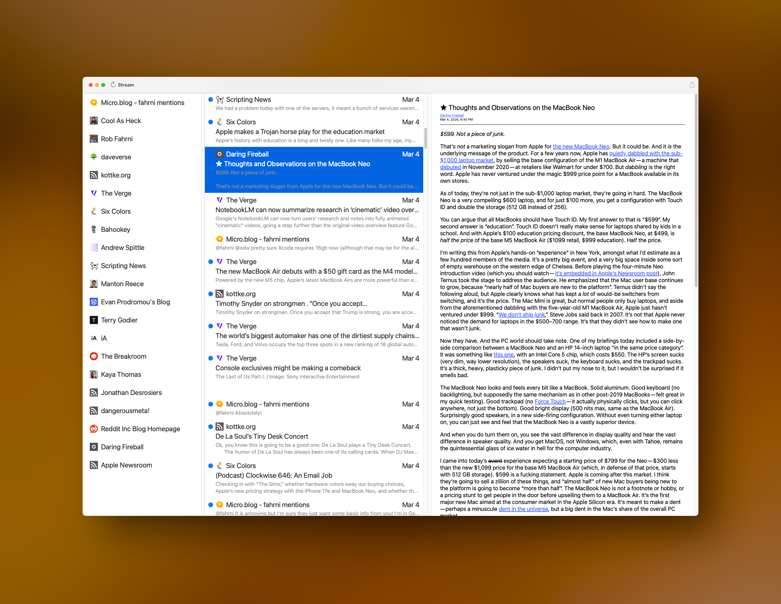
  Some things that need fixing. Selection of a blog item currently has black text and a blue highlight. The text needs to become white so you can read it easier. I’d also like to round the selection rectangle a bit and give it some inset so it doesn’t look so sharp. They currently look like you could cut yourself on them! Same for the middle column. Selection needs some help and that includes the same rounding and inset work. Using the app shouldn’t result in cuts.
 I have a small list of things to do before making a 1.0 release. Once I get those items completed I’ll put together a limited beta and collect some feedback. I need to do a lot of polishing. My tables flicker too much during updates because I reload everything and force the UI to render. Yeah, very heavy handed. If I can minimize the flicker I may ship it like that. Once the Mac version is out I can focus on catching it up to the iOS version and start adding new things to both at the same time. I have so much work ahead of me but that’s perfectly fine!